PTV app

As the UI Lead, I designed and developed the next-gen mobile app, creating a unified design system across PTV's digital channels. The goal is to improve the public transport experience by making the app more intuitive, accessible, and efficient for millions of daily commuters.

Industry

Travel
Transportation
Government

Client

Department of Transport

Service

UI design
Design system

Design leadership

Date

2019 - 2021

01

Project background

Project background

Project background

Victorians were frustrated with the outdated public transport app, which lacked meaningful features and had several accessibility and usability issues. Common complaints included difficulty navigating the app, insufficient disruption information, and challenges managing their myki balances, impacting the commuting experience.

01

Project background

Victorians were frustrated with the outdated public transport app, which lacked meaningful features and had several accessibility and usability issues. Common complaints included difficulty navigating the app, insufficient disruption information, and challenges managing their myki balances, impacting the commuting experience.

02

Our goal

The goal was to create an app that not only improved on these areas but truly served the needs of Victoria’s commuters. By addressing pain points and incorporating user feedback, the aim was to design a user-friendly, accessible platform that enhances the overall public transport experience.

I developed a journey map based on our user research and interviews to highlight their touchpoints, identifying where users encountered friction and their motivations.

I developed a journey map based on our user research and interviews to highlight their touchpoints, identifying where users encountered friction and their motivations.

01

Process

Process

Process

Research data is synthesised to identify common themes and develop user personas. User touchpoints are then mapped, creating a journey map that highlights key interactions and frictions. This map is validated and refined with stakeholders before being integrated into the design process to ensure the user experience effectively addresses identified issues.

The Android redesign process began with user research and competitor analysis to identify pain points. Working with analytics, we assessed what was working and what wasn’t, while usability testing revealed further frustrations. This led to the development of user personas and brainstorming sessions for new features, followed by wireframing and low-fidelity prototypes to visualise concepts.

02

Result

Result

Result

By creating a validated journey map, I ensure that the design aligns with user expectations and enhances usability while effectively addressing pain points. This also helps stakeholders empathise with users, clearly highlighting their challenges and help in prioritising crucial features for development.

The Android redesign process began with user research and competitor analysis to identify pain points. Working with analytics, we assessed what was working and what wasn’t, while usability testing revealed further frustrations. This led to the development of user personas and brainstorming sessions for new features, followed by wireframing and low-fidelity prototypes to visualise concepts.

I developed a journey map based on our user research and interviews to highlight their touchpoints, identifying where users encountered friction and their motivations.

01

Process

Research data is synthesised to identify common themes and develop user personas. User touchpoints are then mapped, creating a journey map that highlights key interactions and frictions. This map is validated and refined with stakeholders before being integrated into the design process to ensure the user experience effectively addresses identified issues.

02

Result

By creating a validated journey map, I ensure that the design aligns with user expectations and enhances usability while effectively addressing pain points. This also helps stakeholders empathise with users, clearly highlighting their challenges and help in prioritising crucial features for development.

We researched top transport apps, assessing their features and user feedback. We then created a pros and cons table for each, using these insights in workshops to guide design decisions and improve on successful features.

We researched top transport apps, assessing their features and user feedback. We then created a pros and cons table for each, using these insights in workshops to guide design decisions and improve on successful features.

We then created an information architecture to map out pages and refine scope, followed by wireframing and usability testing with real commuters.

We then created an information architecture to map out pages and refine scope, followed by wireframing and usability testing with real commuters.

01

Process

Process

Process

An information architecture was created to structure the app, clarify navigation, and prioritise features. It was used to collaborate with stakeholders, refining and agreeing on scope and priorities. Wireframes were then tested and validated with real commuters, ensuring the design addressed pain points, keeping the user at the center of the process.

The Android redesign process began with user research and competitor analysis to identify pain points. Working with analytics, we assessed what was working and what wasn’t, while usability testing revealed further frustrations. This led to the development of user personas and brainstorming sessions for new features, followed by wireframing and low-fidelity prototypes to visualise concepts.

We then created an information architecture to map out pages and refine scope, followed by wireframing and usability testing with real commuters.

01

Process

An information architecture was created to structure the app, clarify navigation, and prioritise features. It was used to collaborate with stakeholders, refining and agreeing on scope and priorities. Wireframes were then tested and validated with real commuters, ensuring the design addressed pain points, keeping the user at the center of the process.

After refining the wireframes, the focus shifted to develop the design system. This included making reusable components like buttons, icons, typography, and color palettes to ensure consistency and scalability throughout the app.

After refining the wireframes, the focus shifted to develop the design system. This included making reusable components like buttons, icons, typography, and color palettes to ensure consistency and scalability throughout the app.

01

Process

Process

Process

Process

The process started with a component inventory, reviewing wireframes and designs to identify the essential UI elements for consistency. Standardised styles for buttons, icons, typography, and colours were created to ensure uniformity and scalability. Collaborating with stakeholders, including the branding team, aligned the visual language across platforms. Comprehensive documentation was created to guide designers and developers in implementing these components. The components were then tested and refined to ensure smooth functionality across different contexts.

The Android redesign process began with user research and competitor analysis to identify pain points. Working with analytics, we assessed what was working and what wasn’t, while usability testing revealed further frustrations. This led to the development of user personas and brainstorming sessions for new features, followed by wireframing and low-fidelity prototypes to visualise concepts.

02

Result

Result

Result

Result

Creating the design system ensured consistency and scalability across the app. The standardised components, like buttons, icons, typography, and colour palettes, provided a cohesive visual experience. Collaboration with the branding team aligned the digital interface with the overall brand, while comprehensive documentation offered clear guidelines for designers and developers, speeding up development. This system improved usability and allowed the design to evolve seamlessly with future needs.

The Android redesign process began with user research and competitor analysis to identify pain points. Working with analytics, we assessed what was working and what wasn’t, while usability testing revealed further frustrations. This led to the development of user personas and brainstorming sessions for new features, followed by wireframing and low-fidelity prototypes to visualise concepts.

One of our goals was to fill the gap left by Google Maps, which, while a trusted navigation tool, is primarily designed for real-time navigation and not specifically for public transport. We aimed to create a user experience that was functional and tailored to the unique needs of Victorian commuters.

One of our goals was to fill the gap left by Google Maps, which, while a trusted navigation tool, is primarily designed for real-time navigation and not specifically for public transport. We aimed to create a user experience that was functional and tailored to the unique needs of Victorian commuters.

Real-time disruption information

Google Maps often lacks timely updates about public transport disruptions, leaving users uninformed during unexpected delays. We aimed to integrate real-time notifications directly into our app, allowing users to stay informed about service changes and plan alternative routes proactively.

Google Maps often lacks timely updates about public transport disruptions, leaving users uninformed during unexpected delays. We aimed to integrate real-time notifications directly into our app, allowing users to stay informed about service changes and plan alternative routes proactively.

01

Process

Process

Process

Process

Research revealed what disruption information mattered to commuters and when they preferred receiving updates. For myki users, travel history data was used to surface disruptions relevant to their regular journeys. Users were also given the flexibility to customise or schedule alerts based on their preferences, without overwhelming them.

The Android redesign process began with user research and competitor analysis to identify pain points. Working with analytics, we assessed what was working and what wasn’t, while usability testing revealed further frustrations. This led to the development of user personas and brainstorming sessions for new features, followed by wireframing and low-fidelity prototypes to visualise concepts.

02

Result

Result

Result

Result

Real-time alerts improved how commuters receive disruption information, making updates timely and relevant. By using Myki travel history, users received personalised notifications linked to their journeys. The ability to customise or schedule alerts gave users control over the information they received, enhancing trust and overall user experience during service interruptions.

The Android redesign process began with user research and competitor analysis to identify pain points. Working with analytics, we assessed what was working and what wasn’t, while usability testing revealed further frustrations. This led to the development of user personas and brainstorming sessions for new features, followed by wireframing and low-fidelity prototypes to visualise concepts.

myki integration

Myki integration

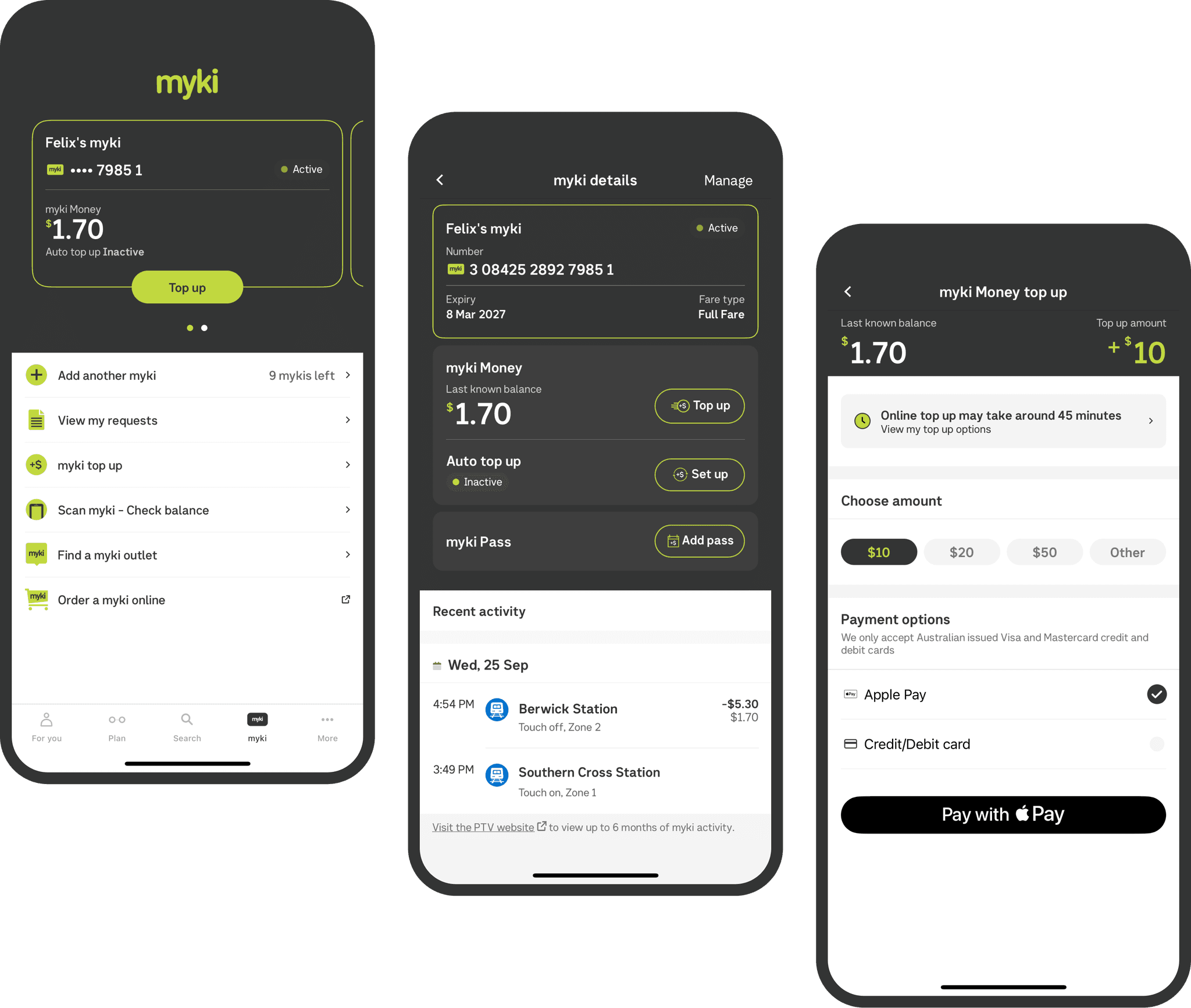
Integrating Myki into the app began with understanding commuter frustrations through user research. Insights revealed that users wanted to avoid queues at Myki machines for checking balances and topping up, especially when rushing to catch trains.

Integrating Myki into the app began with understanding commuter frustrations through user research. Insights revealed that users wanted to avoid queues at Myki machines for checking balances and topping up, especially when rushing to catch trains.

01

Process

Process

Process

Process

We began by defining user needs, focusing on the frustrations commuters face with existing systems. Collaborating with the Myki service team clarified the technical requirements for a seamless experience. Wireframes and prototypes emphasized intuitive access to Myki features, with usability testing ensuring the designs resonated with users. After development, final testing confirmed the integration’s accessibility, leading to a smooth launch that significantly improved how commuters manage their Myki balance and topped up funds.
02

Result

Result

Result

Result

The design focused on making Myki top-ups fast and easy, giving users more control over their travel. This reduced queues at machines, allowing commuters to catch their trains without delays, especially during peak hours.

The Android redesign process began with user research and competitor analysis to identify pain points. Working with analytics, we assessed what was working and what wasn’t, while usability testing revealed further frustrations. This led to the development of user personas and brainstorming sessions for new features, followed by wireframing and low-fidelity prototypes to visualise concepts.

Journey planner

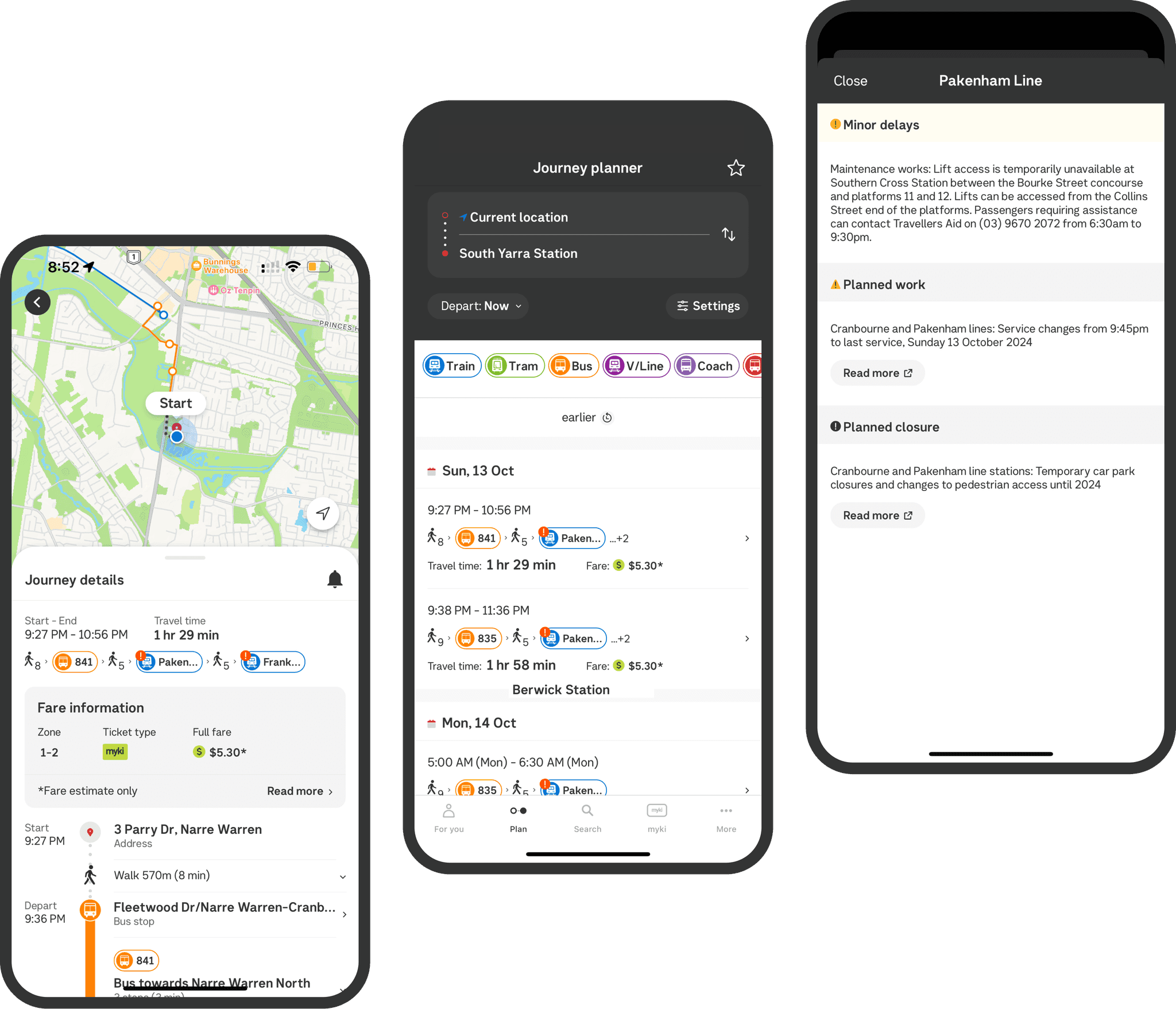
While Google Maps provides general route options, we wanted to enhance the journey planning feature with additional layers of information, including fare estimates and potential disruptions. Our goal was to deliver a more informed and visually engaging journey planner.

While Google Maps provides general route options, we wanted to enhance the journey planning feature with additional layers of information, including fare estimates and potential disruptions. Our goal was to deliver a more informed and visually engaging journey planner.

01

Process

Process

Process

Process

We started with identifying user pain points, leading to the integration of live vehicle tracking for real-time location updates. We enhanced the map’s usability by managing clusters at various zoom levels, ensuring clarity and ease of navigation. Extensive testing refined user interactions and access to nearby stops and live updates. The result is a more intuitive journey planner that provides accurate fare estimates and detailed schedules, helping users navigate public transport with confidence.
02

Result

Result

Result

Result

The journey planner upgrade focused on delivering a more useful experience by adding fare estimates, real-time alerts, and live vehicle tracking, so commuters could see both their location and transport movements in real-time. The improved design helped users plan their trips with fewer disruptions and more certainty, giving them more control over their journeys. By refining the interface and providing clear, up-to-date information, it made navigating public transport simpler and more reliable.

User-centric
search features

Myki integration

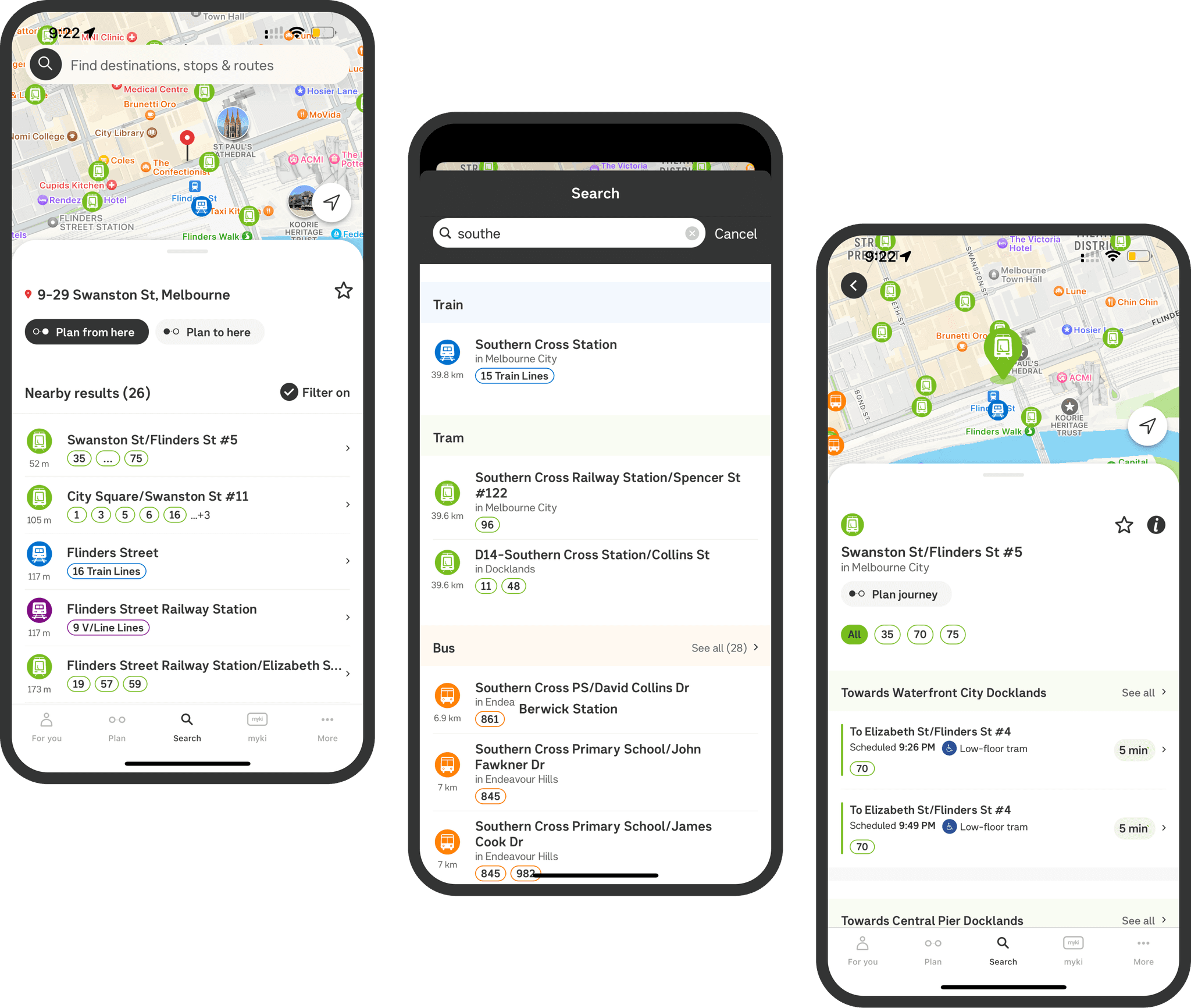
The search feature was developed to focus on public transport needs specifically. This involved refining search algorithms to prioritise nearby public transport stops, schedules, and relevant journey details. Usability tests helped fine-tune the interface to ensure easy access to the information users needed most.

The search feature was developed to focus on public transport needs specifically. This involved refining search algorithms to prioritise nearby public transport stops, schedules, and relevant journey details. Usability tests helped fine-tune the interface to ensure easy access to the information users needed most.

01

Process

Process

Process

Process

We focused on enhancing search features by making nearby stops, live updates, and transit details more accessible. The map was refined for better cluster management at different zoom levels to prevent overcrowding while keeping it clean and easy to navigate. Significant user testing and refinements were done to improve map interactions and gestures, ensuring smooth navigation and access to real-time updates on stops and departures. Additionally, search was personalised, allowing users to quickly find relevant transport information tailored to their needs, providing a superior alternative to Google Maps.
02

Result

Result

Result

Result

The new search features provided quicker access to nearby stops and live updates, with a clean, responsive map that adapted smoothly to zoom levels, avoiding clutter. Commuters could now locate essential public transport information effortlessly, including real-time departures and arrivals. The improved user interactions, gestures, and personalisation created a fluid experience, enabling users to manage their journeys better. The enhancements significantly outperformed Google Maps in terms of public transport-specific features, giving commuters more control and convenience.

The Android redesign process began with user research and competitor analysis to identify pain points. Working with analytics, we assessed what was working and what wasn’t, while usability testing revealed further frustrations. This led to the development of user personas and brainstorming sessions for new features, followed by wireframing and low-fidelity prototypes to visualise concepts.

Accessibility

As a government product, our app must prioritise accessibility, ensuring that all users can easily navigate public transport information. Current apps in the market, including Google Maps, often fall short in meeting these needs, lacking comprehensive accessibility features.

As a government product, our app must prioritise accessibility, ensuring that all users can easily navigate public transport information. Current apps in the market, including Google Maps, often fall short in meeting these needs, lacking comprehensive accessibility features.

01

Process

Process

Process

Process

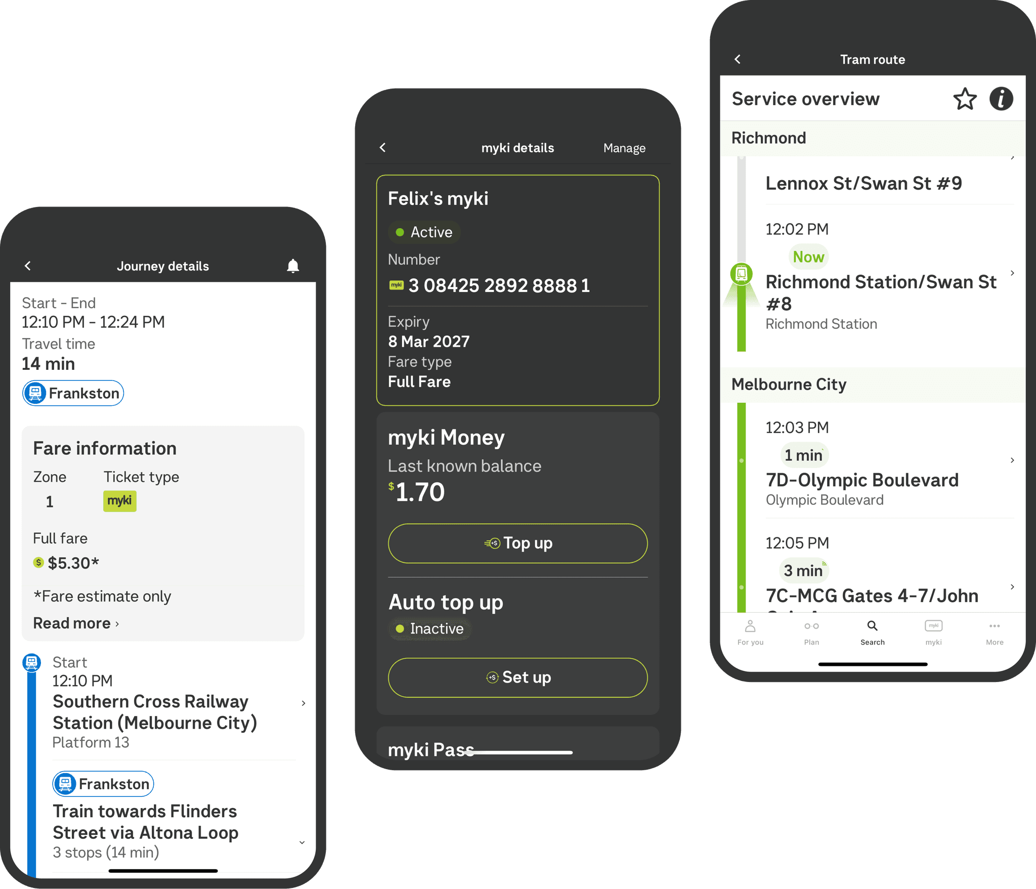
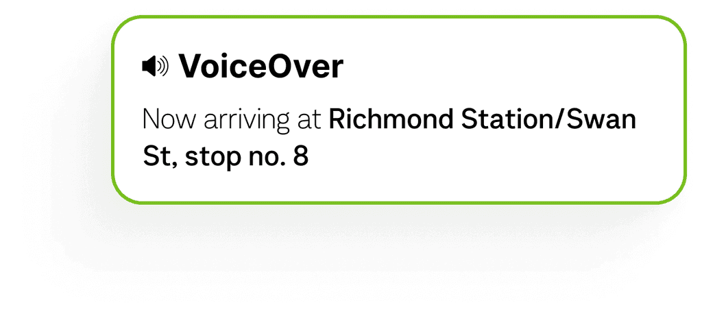
We collaborated with Vision Australia to establish accessibility standards and best practices. This involved implementing features such as large text, reduced motion, voice-over support, and high-contrast settings. Simplified navigation was also a focus to cater to diverse user needs. Extensive usability testing with real users helped refine these features.
02

Result

Result

Result

Result

The app’s focus on accessibility set a new standard for government apps, ensuring an inclusive experience for all Victorians. By prioritising accessibility, we significantly improved usability for individuals with disabilities. This commitment positioned our app as a leader in accessibility, filling a gap that existing solutions, including Google Maps to name a few.
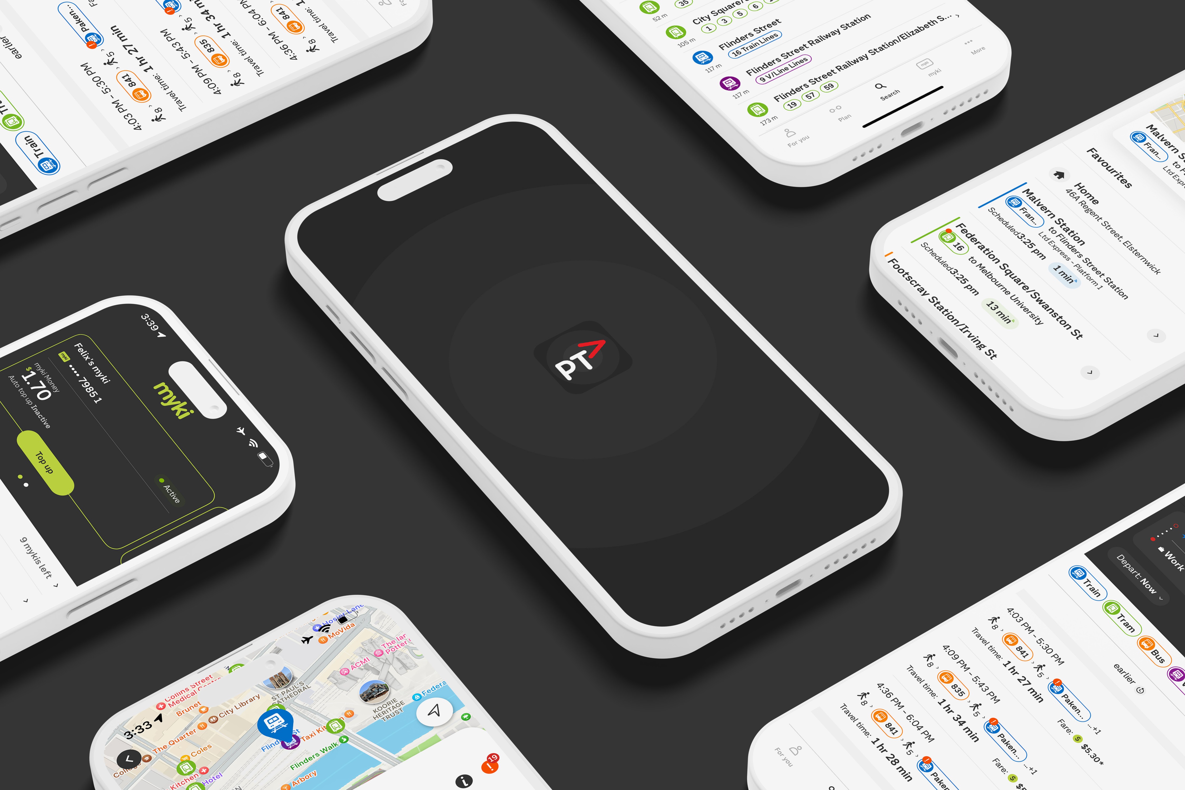
…and many more new features

…and many more new features

Live Tracking

Live tracking shows the real-time location of transport, helping commuters plan more confidently.​

Replacement buses are now running between Frankston and South Yarra due to a signal fault.

View alternative route

Bus replacing trains

Smart Journey Notifications

Stay updated on disruptions so you can adjust your commute effortlessly.

Auto top-up

Set Auto Top-up

To ensure your balance is always ready for your next trip.

Personalised Notifications

Stay updated on your commute with personalised notifications for specific stations or routes.

Platform Navigator

Real-time guidance and step-by-step directions within stations, ensuring smooth transitions between journeys.

Personalised Notifications

Stay updated on your commute with personalised notifications for specific stations or routes.

Platform Navigator

Real-time guidance and step-by-step directions within stations, ensuring smooth transitions between journeys.